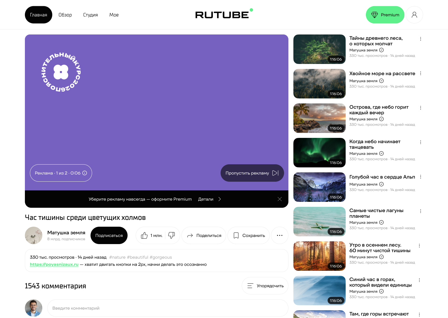
A redesign of the plan selection, payment, and subscription management pages for a service with a million-strong audience.
Users were abandoning subscription checkout before reaching payment: plans were described vaguely, auto-renewal terms were hidden in fine print, and there was no sense of completion after payment.
This isn't a one-off diagram made for this case — it's the process I've built for myself and repeat on most projects. Discover and Define come before the first sketch, so the solution answers a confirmed problem rather than an assumption. Test sits before Handoff: if the hypothesis doesn't hold up on the prototype, it's cheaper to go back to Design than to redo finished documentation. Design Review at the end serves as a checkpoint: the solution is checked against the team before being considered done.
| Entry context | Intrusiveness | Value clarity | Free vs Paid | Price transparency | Trial period | Steps to checkout |
Payment ease | Cancellation clarity | |
|---|---|---|---|---|---|---|---|---|---|
![]() |
|||||||||
![]() |
— | — | — | — | — | — | — | — | |
![]() |
|||||||||
![]() |
|||||||||
![]() |
|||||||||
![]() |
|||||||||
![]() |
| Like | Dislike | Ignored | About the subscription | |
|---|---|---|---|---|
![]() |
huge content selection |
ads, "push toward premium" |
smart settings |
valued for no ads + offline features |
![]() |
accessibility |
irrelevant recommendations |
offline features |
— |
![]() |
movies + everything else |
weak catalog |
fine-grained player settings |
good value if you already need Plus |
![]() |
large catalog |
"unexpected charges" |
turning off auto-renewal |
discounts |
![]() |
content quality |
second checkout |
free content |
expectation of "all-inclusive" |
![]() |
cheap |
narrow content, subscribing for just one show |
niche service, not a universal streaming hub |
app quality ≠ price |
![]() |
all TV archives in one place |
poor UX/UI |
archive size |
— |
Core audience — 25–34: has disposable income, mature with digital products, already used to living on subscriptions. But within it — not one single behavior pattern.
In-depth interviews with audience representatives showed: the same action — subscribing — hides different motives, fears, and expectations.
Main Push — annoying ads
Main Pull — no ads + a sense of control
Main Anxiety — auto-charges and opacity
Main Habit — "it's fine for free anyway"
| Stage | Trigger | Subscription page | Plan selection | Card entry | Payment completion | After payment |
|---|---|---|---|---|---|---|
User actions |
Sees an ad / a limit |
Studies the subscription terms |
Analyzes the available plans |
Enters payment details |
Completes the payment |
Returns to viewing. Gets a charge reminder. Decides whether to renew |
Thoughts |
Fed up with it. Maybe worth subscribing |
What's included? Is there a catch? |
Why am I being offered this specifically? |
When will I be charged? Can I cancel? |
Is that it? Where's the confirmation? |
The ads are gone. When's the next charge? Should I renew? |
Emotions |
Annoyance |
Wariness |
Doubt |
Anxiety, wariness |
Neutral, mild confusion |
Relief at first. Anxiety closer to the charge date if there's no reminder |
Pain points |
Ads are in the way |
Text overload |
No explanation of differences |
Auto-renewal on by default |
No sense of completion |
No charge reminder. Hard to find where to cancel. Unclear what perks the subscription gives |
Opportunities for improvement |
Clearly show the subscription's value |
Clear visual hierarchy |
Justification for the recommended plan |
Explicit next charge date |
A vivid confirmation screen |
Push/email reminder 3 days ahead. A visible "manage subscription" link. Next-charge info right on the success screen |
| Stage | Trigger | Subscription page | Plan selection | Card entry | Payment completion | After payment |
|---|---|---|---|---|---|---|
User actions |
Watching a video, hits an ad |
Goes to the checkout page |
Quickly scans the options |
Enters the card |
Completes the payment |
Returns to viewing, stops thinking about the subscription |
Thoughts |
Oh come on, how much longer |
Where's the button? |
I just want no ads, nothing else matters |
Let's get this over with |
No more ads now? |
Finally, no ads, great |
Emotions |
Annoyance |
Impatience |
Doubt, if there are too many options |
Annoyance, if there's more than one or two steps |
Relief, if the effect is instant |
Relief, then — zero further attention to the topic |
Pain points |
Ads are in the way |
Text overload |
Too much choice |
Extra fields |
Unclear whether the subscription activated |
Doesn't track charges, finds out about renewal only after the fact in the bank app, doesn't remember how to cancel if needed |
Opportunities for improvement |
Give a quick, obvious path to the subscription with no extra text or explanations |
One primary plan, a large button, minimal secondary info on the first screen |
Clearly state the base scenario: "No ads — X ₽ per month." Everything else is secondary |
Minimal fields, a linear process, no upsells at this stage |
Ads disappear instantly + a short, clear success screen |
One unobtrusive notification right after payment (no ads + where to cancel), then leave it alone |
When I open the subscription page and don't understand the terms, I want to find clear information about the price, charge date, and cancellation, so I don't feel like I've been deceived.
When I've just paid for the subscription, I want to immediately see the next charge date and quickly find subscription management, so I stay in control of the situation.
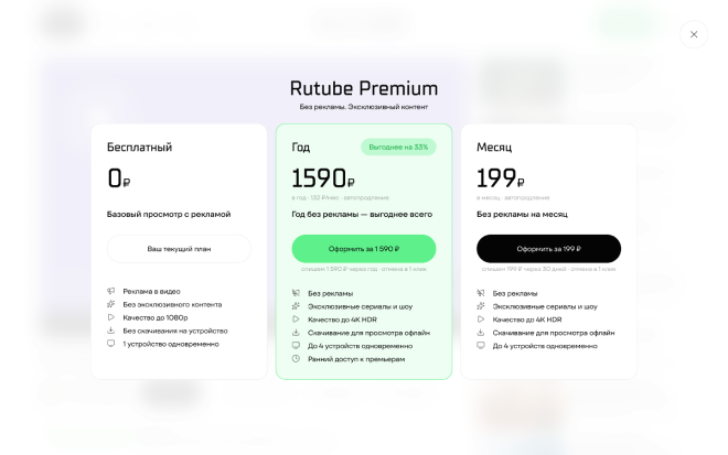
When I'm choosing a plan and don't understand how paid differs from free, I want to see a clear comparison, so I pay deliberately, not blindly.
When an ad interrupts my viewing, I want to remove it in as few steps as possible, so I can get straight back to the video without frustration.
When I see the checkout page, I want to see one clear plan and pay right away, so I don't have to sort through options or waste time.
When I've just paid for the subscription, I want to immediately see that the ads are gone, so I can confirm it all worked and stop thinking about it.
The diagram is wider than the screen — pinch to zoom in

Viewing without a subscription
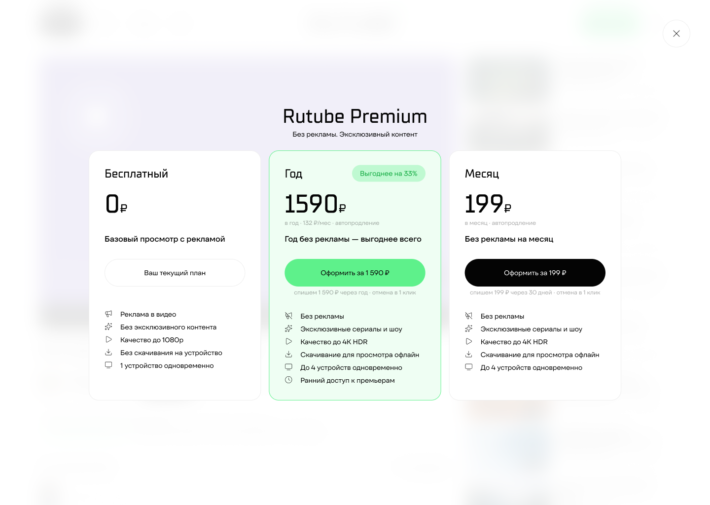
Plan selection
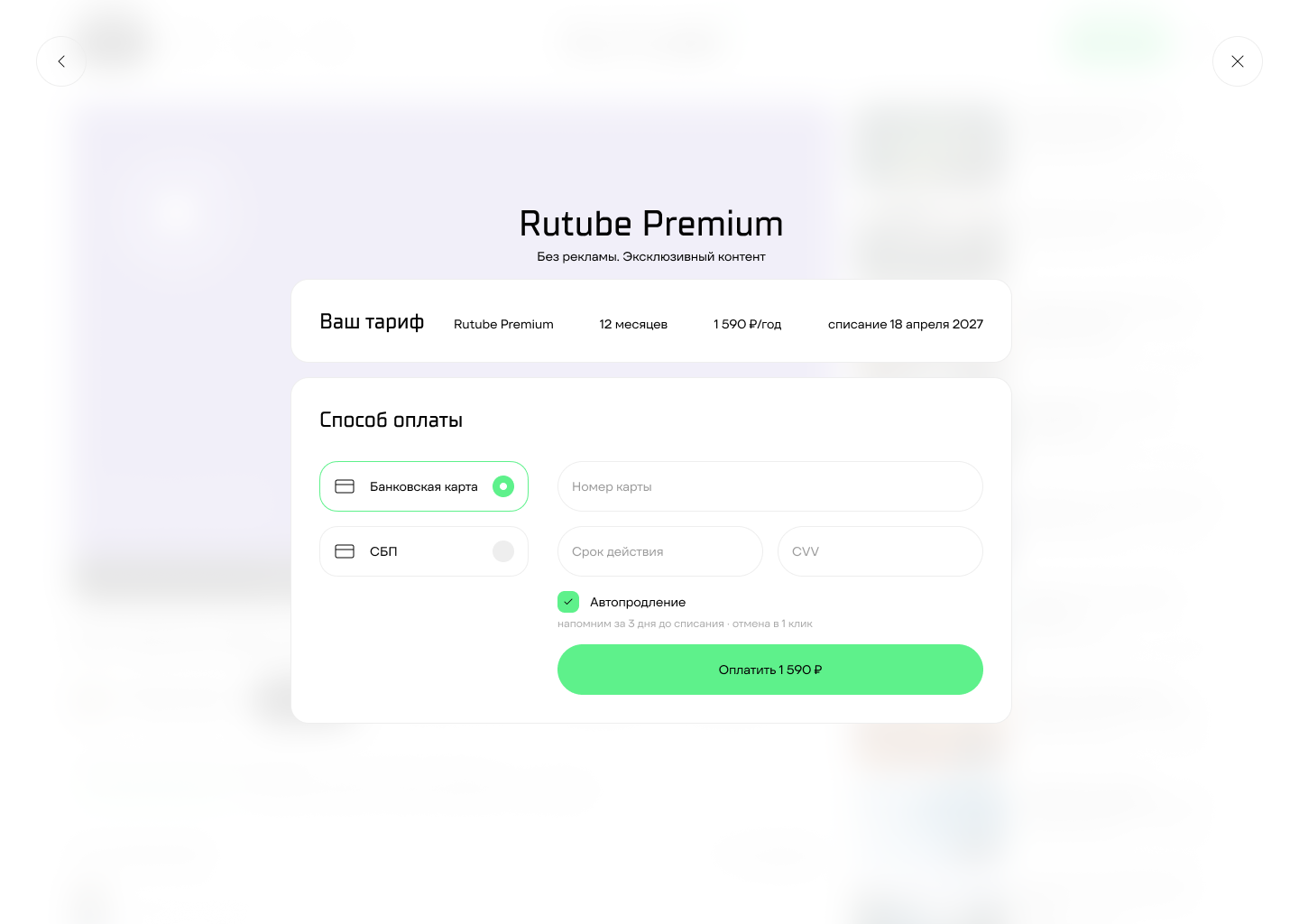
Payment

Successful payment

Payment error
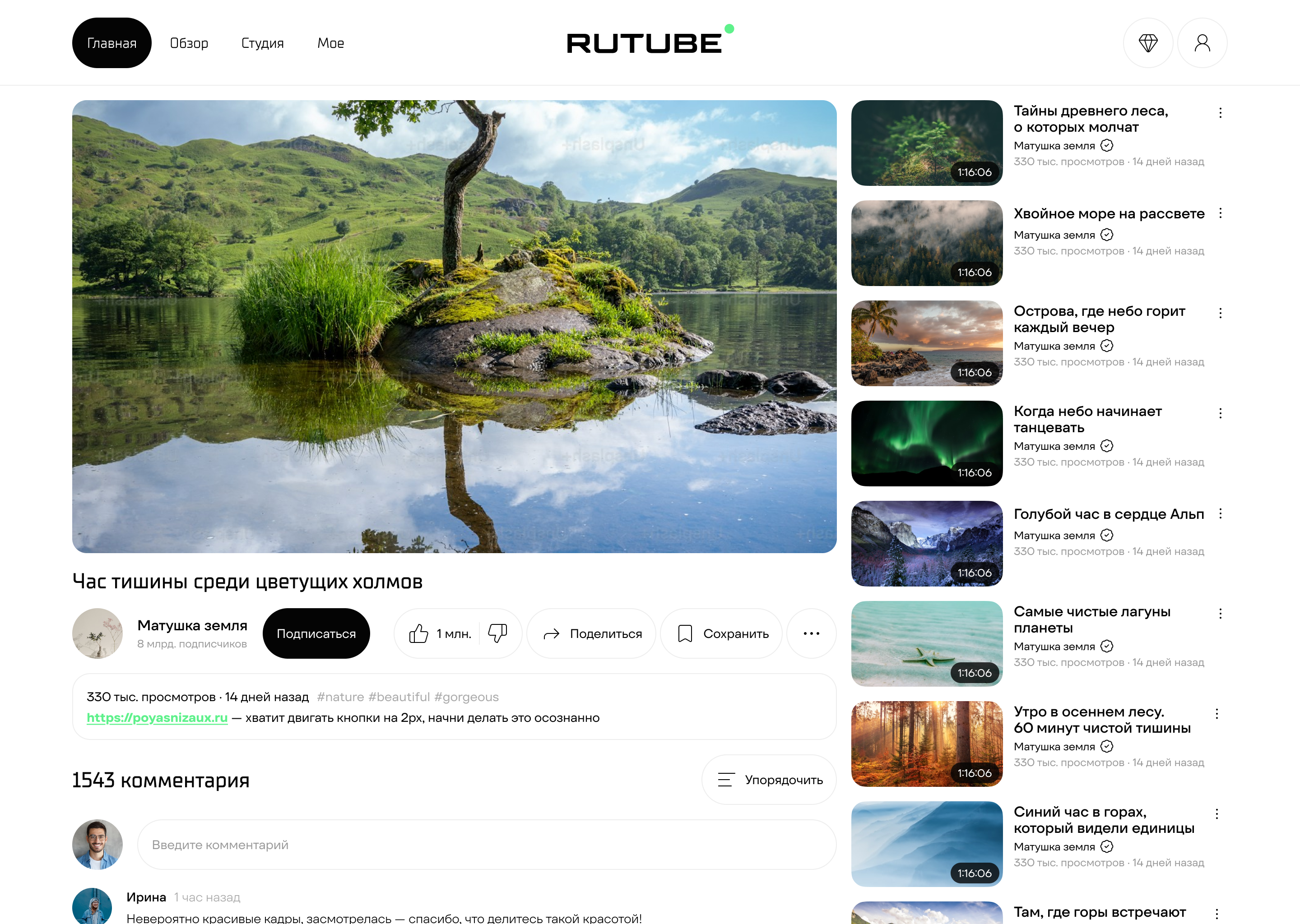
Viewing with a subscription
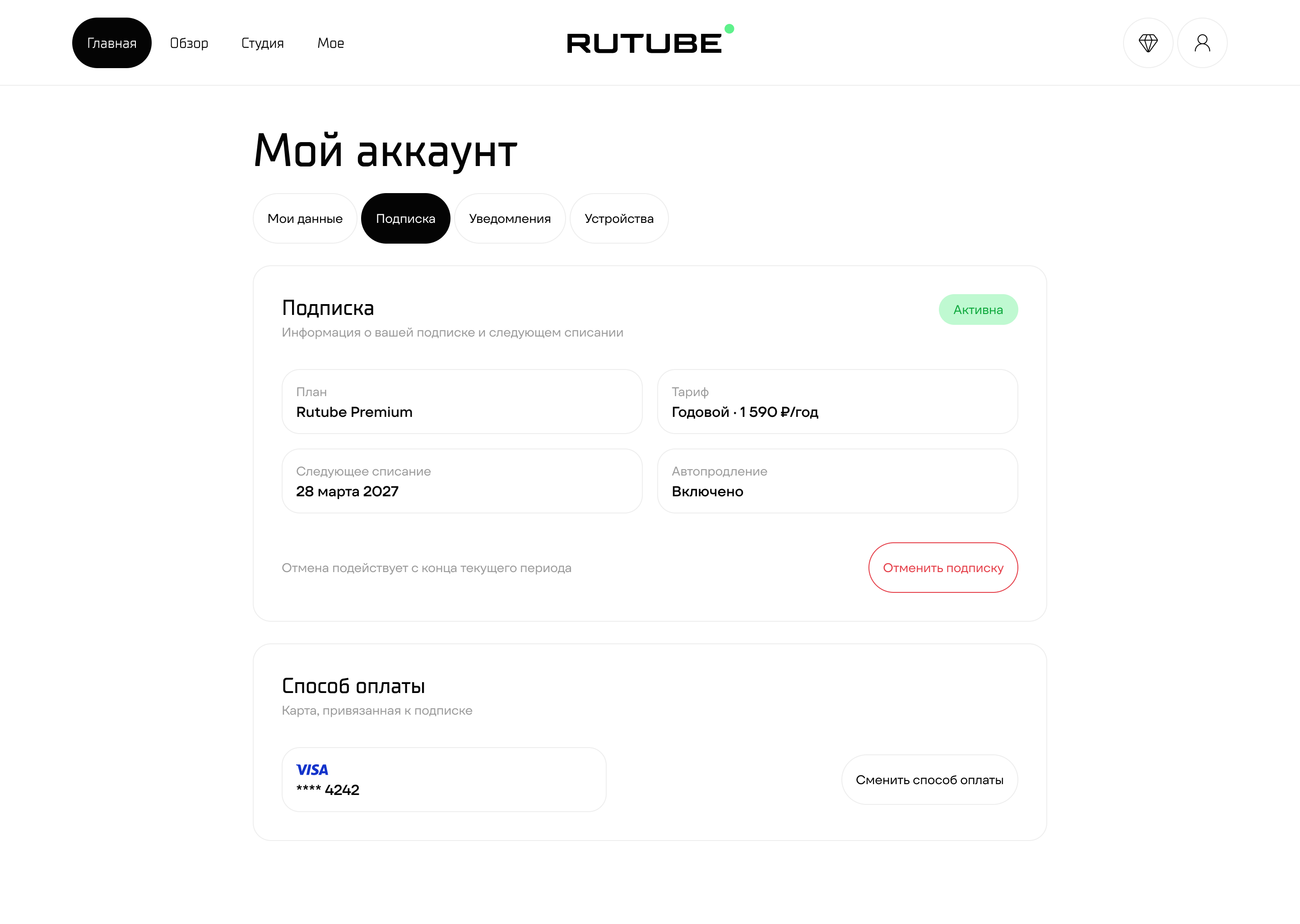
Subscription management
If the subscription terms are made clear upfront — an explicit plan comparison, a visible charge date, a sense of completion after payment — users will stop abandoning checkout, and the process itself will become noticeably simpler. Validated through moderated testing of a clickable prototype: the same respondents as in the research phase — which let them compare the old Rutube flow and the new prototype from their own experience.

| No. | Flow step | Passed? | Time | Errors and snags | Quotes and observations |
|---|---|---|---|---|---|
1 |
Video and ad banner |
Yes |
28 sec |
Tapped the like button, tried to close the banner at the bottom |
"Oh no, damn, an ad. I want to skip it, but I just can't skip it outright" |
2 |
Plan selection |
Yes |
10 sec |
— |
"This is convenient, because there's a clear benefit for me." Immediately picked the annual plan, appreciated the price comparison |
3 |
Payment form |
Yes |
20 sec |
— |
First chose a bank card, entered the details |
4 |
Error screen |
Yes |
5 sec |
Wasn't thrown off |
"Couldn't process the card details — let's try again, but probably better with the Fast Payment System this time." Immediately decided to switch payment method |
5 |
Retrying payment |
Yes |
5 sec |
— |
Via the Fast Payment System — successful |
6 |
Success screen |
Yes |
15 sec |
— |
"Subscription active, ads off, I can see the next charge. There's even a reminder — awesome." Tapped "Continue watching" |
7 |
Subscription management |
Didn't go in |
— |
— |
Noticed the "Manage subscription" button but didn't click it: "I understand what subscription management is about — just not relevant for me right now" |
The flow confirmed the hypothesis: both archetypes' pain points are closed, success criteria met at 100%.
Archetypes work as a frame, but not a rigid one: behavior can diverge from the original classification depending on context.
SEQ 6.3 out of 7, SUS 91.7 out of 100 — high simplicity and ease of use.
Two growth points found: the error screen reads as a dead end, and the cancel button on the success screen is visually weak.
Transparent terms and explicit control over the subscription removed the main fear — hidden charges.
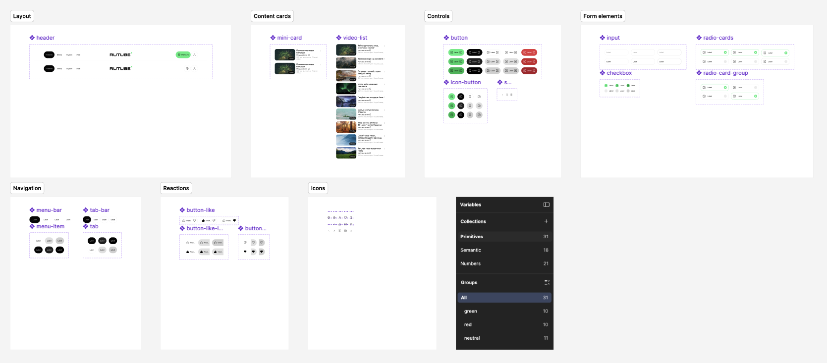
To make the solution implementation-ready, a two-tier token system and UI kit were built.